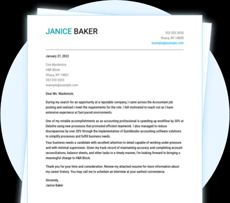
Understanding the Importance of Font Choice
The font you choose for your cover letter might seem like a small detail, but it plays a surprisingly significant role in how your application is perceived. In today’s competitive job market, where every detail counts, selecting the right font can be the difference between getting your foot in the door and being overlooked. It’s not just about aesthetics, it’s about readability, professionalism, and subtly conveying your attention to detail. The font you select sets the tone of your letter, influencing the reader’s first impression and potentially impacting their perception of your qualifications and personality. A well-chosen font communicates that you’re polished, professional, and thoughtful. Conversely, a poorly chosen font can distract the reader, making your letter harder to read and potentially undermining your credibility.
The Impact of Font on First Impressions
Your cover letter is often the first impression you make on a potential employer, and the font you use is an integral part of that impression. A clean, easy-to-read font projects competence and professionalism. It shows that you’ve taken the time to consider every aspect of your application. The right font makes your cover letter accessible, encouraging the reader to engage with your content. Conversely, a font that is too ornate, too small, or difficult to read can create a negative impression. It suggests a lack of attention to detail or even a lack of respect for the reader’s time. The goal is to make it as easy as possible for the hiring manager to understand your message. You want them to focus on your skills and experience, not struggle to decipher your chosen typeface. Ultimately, the font contributes to the overall presentation of your application, setting the stage for a positive or negative initial assessment.
Top 5 Cover Letter Fonts to Consider
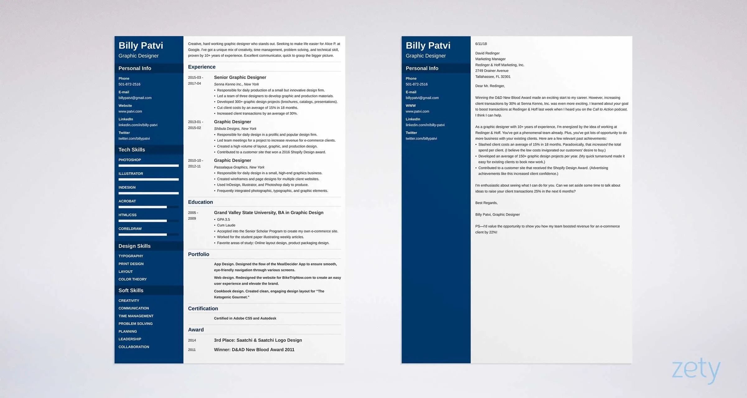
Choosing the right font for your cover letter can be a game changer. While personal preference plays a role, some fonts are consistently better choices than others due to their readability and professional appearance. Here are five of the best fonts to consider when crafting your cover letter, each with its own unique characteristics and advantages. Remember, the goal is always to select a font that is clear, easy to read, and reflects a professional image. Sticking with these tried-and-true options is a great way to ensure your cover letter makes a positive impression.
Arial
Arial is a widely used sans-serif font known for its clean and modern look. Its straightforward design makes it incredibly readable, even at smaller sizes. Arial is a safe and reliable choice that conveys professionalism without being overly formal. Its versatility allows it to work well in a variety of applications, including cover letters, resumes, and other professional documents. Because it is a default font on many systems, it ensures your document will display correctly, regardless of the recipient’s operating system or software. Arial provides a crisp, clear appearance that is easy on the eyes, making your cover letter a pleasure to read. The simple design of this font ensures that the content is always the focus, allowing your skills and experience to shine.
Why Arial Works for Cover Letters
Arial’s popularity as a cover letter font is due to its inherent readability and neutral style. Its sans-serif design contributes to a modern aesthetic that is simultaneously approachable and professional. Arial’s even spacing and clear letterforms make it effortless to read, crucial when a hiring manager is reviewing many applications. Moreover, Arial’s widespread availability is another significant advantage. You can be confident that the document will display correctly on any computer. The font’s familiarity also plays a role. It presents an air of confidence and professionalism, suggesting that you are a well-rounded professional who values clarity and efficiency. Arial simply does not distract the reader from the content; rather, it subtly enhances the overall presentation of your cover letter.
Times New Roman
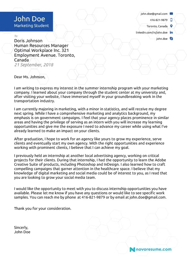
Times New Roman is a classic serif font, revered for its traditional and elegant appearance. It has been a standard in professional documents for decades, and for good reason. Its distinctive serifs (the small strokes at the end of each letter) aid in readability, especially in printed documents. This font projects a sense of formality and tradition, making it a fitting choice for more conservative industries. It is a great choice when you want to convey a sense of seriousness and attention to detail. Despite its traditional nature, Times New Roman remains a solid choice for cover letters, especially when you aim to convey a sense of established professionalism and experience.
The Timeless Appeal of Times New Roman
The enduring appeal of Times New Roman lies in its proven track record as a highly readable and professional font. Its serifs help guide the reader’s eye across the page, making the text easy to scan and digest. This font’s traditional appearance lends itself well to fields that value formality and established norms. Its familiarity is another significant advantage. Hiring managers are accustomed to seeing this font, so it projects a sense of reliability and professionalism. Times New Roman can be particularly suitable if you are applying for roles in fields like law, finance, or academia, where a classic and formal presentation is often appreciated. The timeless elegance of this font conveys that you understand and respect the professional expectations of the industry.
Helvetica
Helvetica, a clean sans-serif font, is celebrated for its modern and minimalist aesthetic. Its simplicity and clarity make it highly readable, even in smaller sizes. Helvetica projects a sense of contemporary professionalism and is a great option for industries that value innovation and forward-thinking. Its neutrality ensures that the focus remains on the content of your cover letter. The font’s understated design allows your skills and experiences to take center stage. Helvetica is an excellent choice for those seeking to project a polished, modern image. It is a versatile choice that works well in various professional contexts and can help your application stand out with its sleek and uncluttered appearance.
Helvetica’s Modern and Clean Look
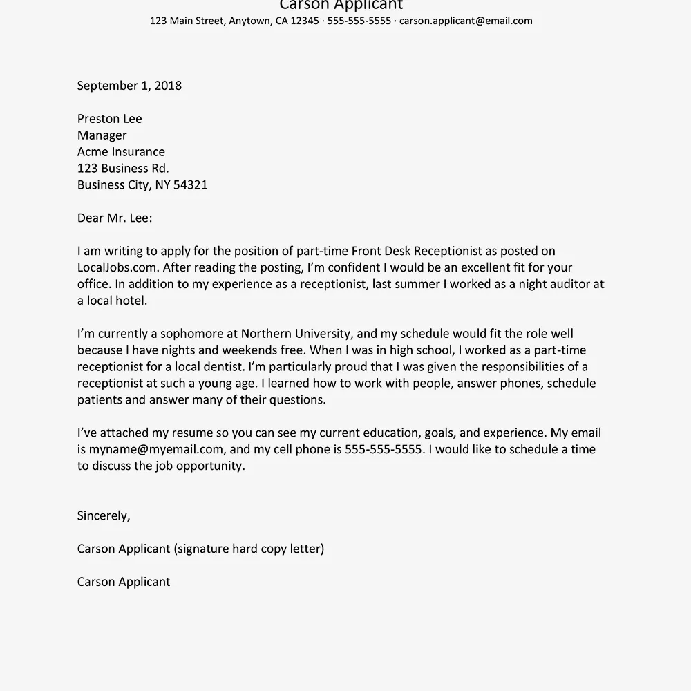
Helvetica’s appeal lies in its ability to combine exceptional readability with a contemporary look. Its clean lines and lack of serifs make it appear modern and fresh, which can be advantageous if you are applying for roles in creative industries or in companies with a progressive culture. The font’s uncluttered design minimizes visual noise, making it easier for the reader to concentrate on your message. This simplicity suggests a sense of professionalism and sophistication without being overly formal. Helvetica’s versatility makes it suitable for a wide range of applications. If your aim is to project a forward-thinking image, this font could be an excellent choice. The modern aesthetic projects that you are up-to-date with current design trends.
Georgia
Georgia, a serif font, is known for its exceptional readability, even at smaller sizes. It was specifically designed for on-screen use, making it an excellent choice for cover letters that might be viewed digitally. Georgia projects a sense of warmth and approachability, while maintaining a professional appearance. The font’s slightly rounded serifs add a touch of personality without compromising its professional character. This font is well-suited to a wide variety of industries and applications, making it a universally appealing option. Its ease of readability ensures that your cover letter content is accessible. By selecting Georgia, you are demonstrating that you are conscientious and thoughtful about the candidate experience.
Georgia’s Readability Advantages
Georgia’s design prioritizes readability, which makes it an excellent choice for cover letters, particularly those viewed online. Its clear letterforms and generous spacing make it easy for the reader to scan the text. This is especially important, considering that many hiring managers may initially review cover letters on a screen. The slightly thicker strokes of Georgia enhance its legibility, making it a comfortable choice for extended reading. The font’s design ensures that it remains easily readable across different screen resolutions and sizes. Georgia’s readability advantage translates into a more positive experience for the reader. The overall impact is a more professional presentation of your application.
Calibri
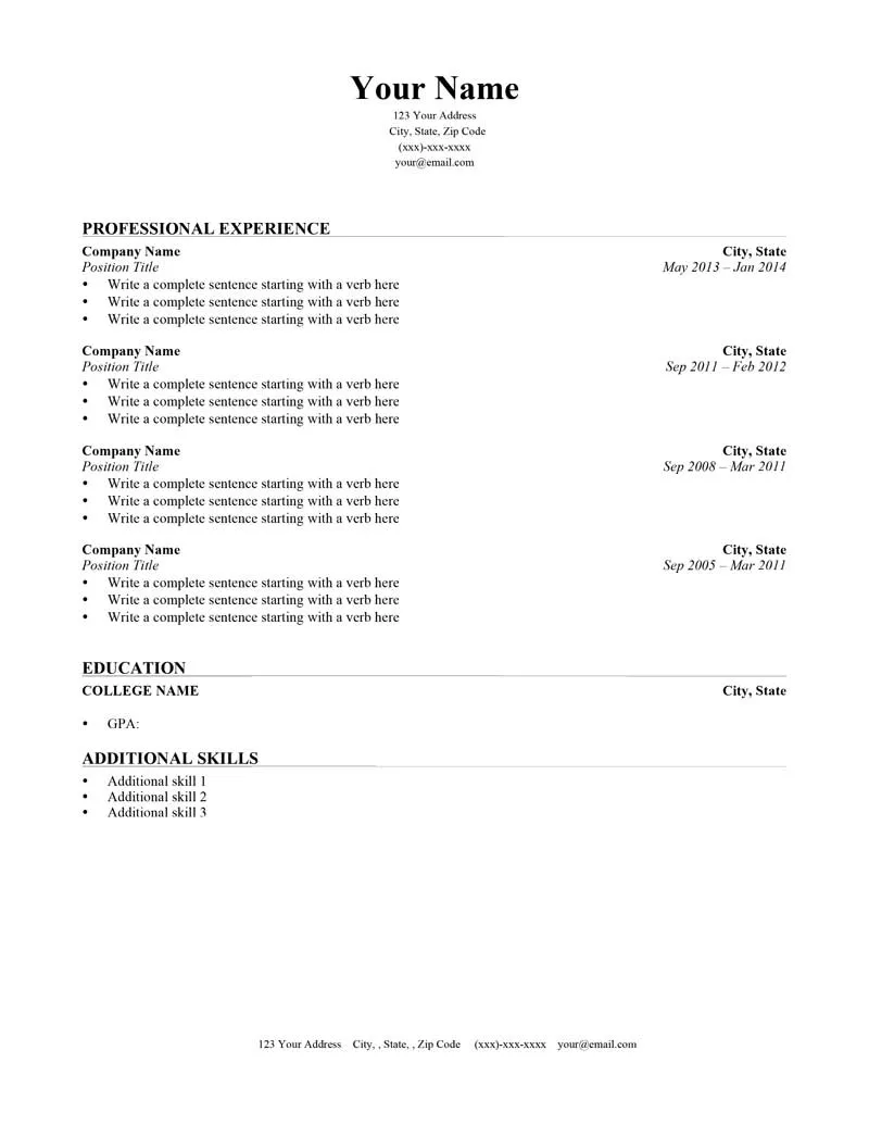
Calibri is a sans-serif font that projects a contemporary and clean look. It has become a popular choice in professional documents due to its modern appearance and excellent readability. The font’s soft curves and open letterforms create a friendly impression while maintaining a high level of professionalism. Calibri is a versatile option that works well across different industries and contexts. It is often used in a variety of professional communications. The font’s overall presentation is easy on the eyes. By using this font, you are demonstrating that you value a modern yet professional presentation. The familiarity of Calibri often makes it a safe and effective choice.
Calibri’s Contemporary Style
Calibri’s contemporary style is a key reason it is often selected for cover letters. Its balanced proportions and subtle curves create a visually appealing font that is easy to read and modern. The font’s subtle design ensures that your cover letter has a professional look without appearing overly formal. Calibri’s modern aesthetic can be advantageous in industries that value innovation and a forward-thinking approach. This font’s overall presentation will signal to the reader that you are current and professional. Choosing Calibri shows that you understand the evolving standards of professional communication and are well-suited for the job.
Key Considerations When Choosing a Font
Choosing the right font involves more than just picking one that looks good. Several factors should be taken into account to ensure your font choice enhances the readability and effectiveness of your cover letter. Consider the target industry, your personal brand, and how the font will appear in print and on screen. Always keep your audience in mind and choose a font that aligns with their expectations. The best fonts balance aesthetics and functionality. Remember that the goal is to make your cover letter clear, easy to read, and visually appealing. The right font demonstrates attention to detail, a key aspect of professionalism. Make sure the font you choose supports and enhances the message you are trying to communicate.
Font Size and Readability
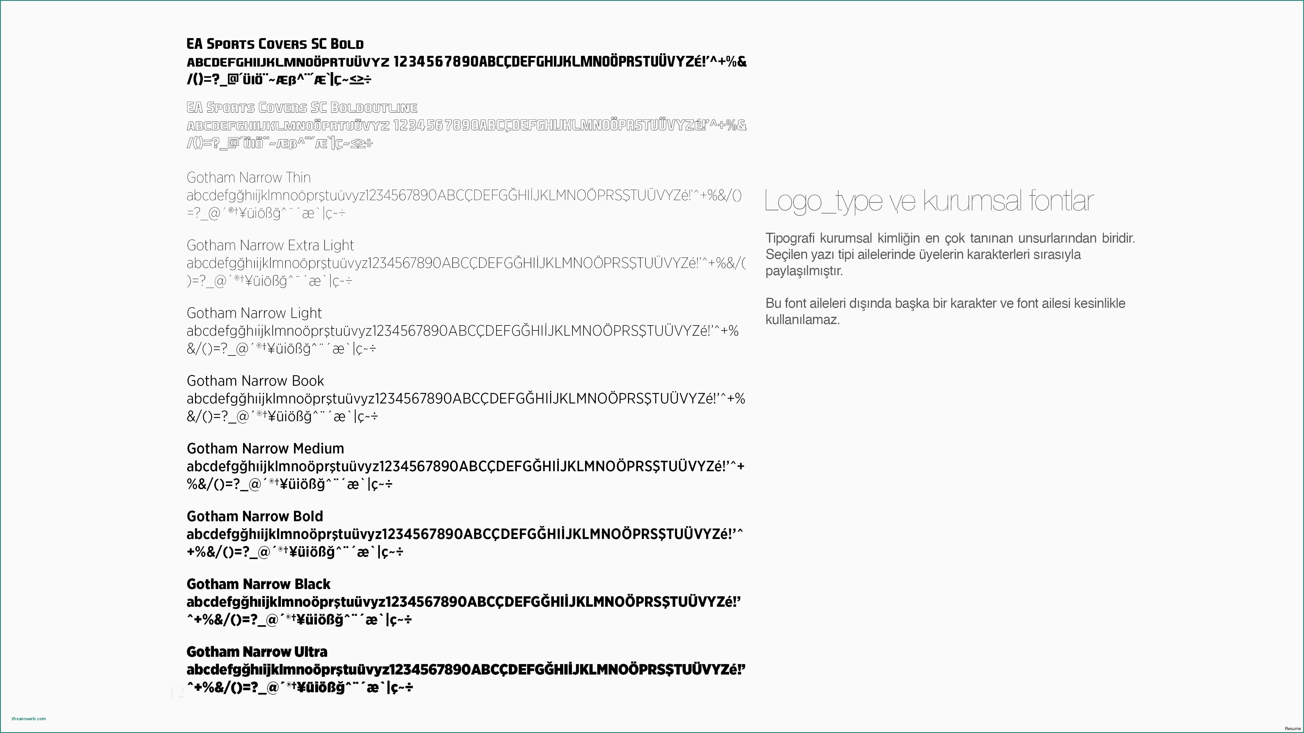
The size of your font is just as important as the font itself. A font that is too small will strain the reader’s eyes. One that is too large will appear unprofessional. A standard font size for cover letters is between 10 and 12 points. This range provides a balance between readability and the overall look of your letter. You should also consider how the font size affects the layout and length of your cover letter. Make sure the font size complements the font style. Test your cover letter on different devices to ensure its readability. The right font size will make your cover letter easy to read, and it will show that you are conscientious of the hiring manager’s time.
Font Style and Personality
While it is essential to choose a font that is clear and professional, the font you select can also reflect your personal brand and personality. When selecting a font, try to align your choice with the tone and message you want to convey. A clean and modern sans-serif font may be appropriate if you are applying for a tech-related position. In contrast, a traditional serif font might be better for roles that value formality. Keep the industry and role in mind when selecting a font style. Your goal should be to reflect your personality and demonstrate your understanding of the professional standards. This consideration demonstrates that you are attentive to detail, a trait highly valued by potential employers.
Consistency Across Your Application
Maintain consistency in your font choices throughout your entire application package. Use the same font for your cover letter, resume, and any other supporting documents. This creates a cohesive and professional look, demonstrating your attention to detail and design. Be sure to use consistent font sizes for headings, body text, and other elements. Inconsistencies can appear sloppy and undermine the overall presentation. By establishing consistency, you present a professional image. This simple measure goes a long way in creating a strong first impression. Consistency in your applications conveys that you’re organized, and that you value professionalism.
Avoiding Common Font Mistakes
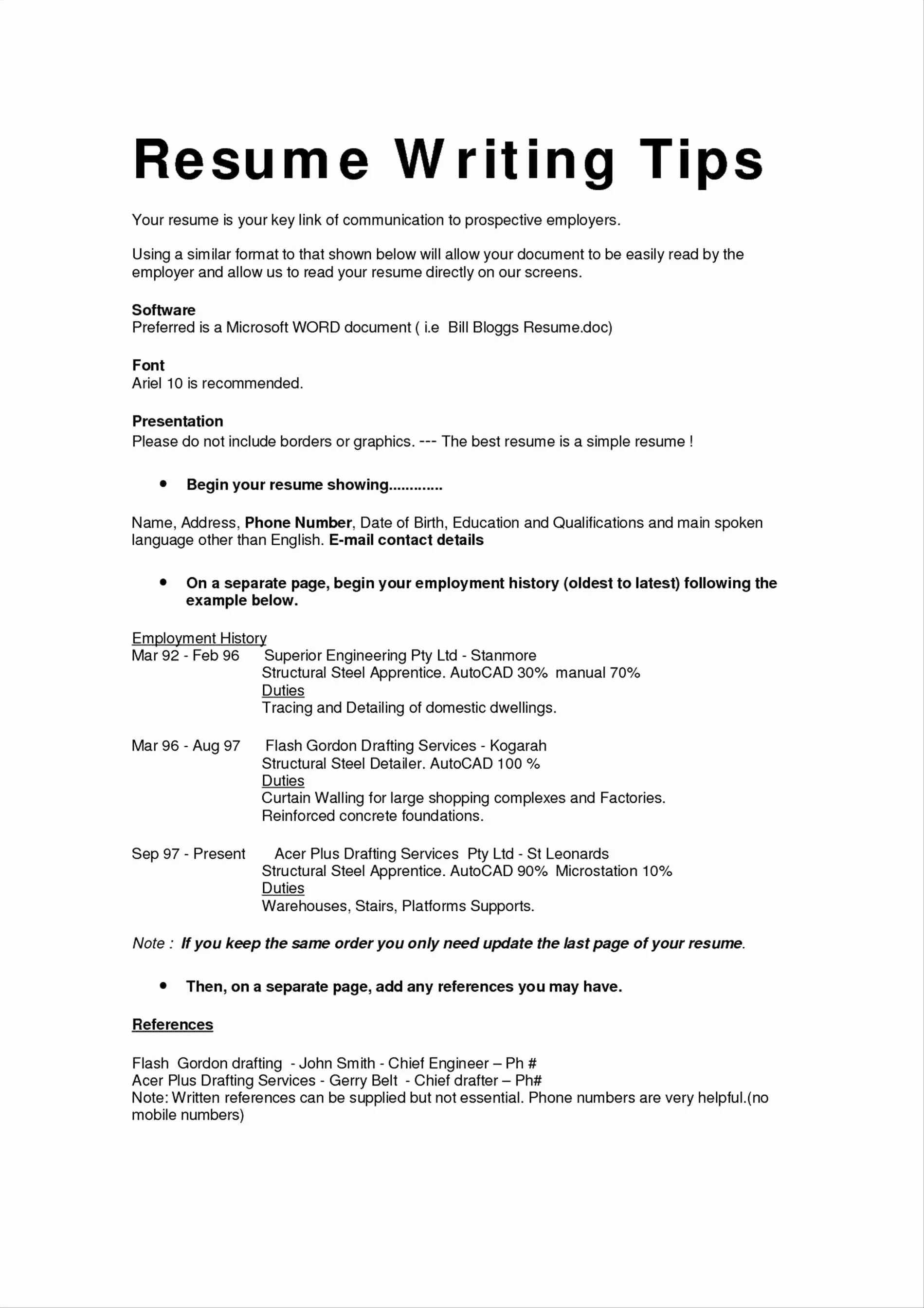
Even the most qualified candidates can make mistakes when it comes to font choice. There are several common errors you should avoid to ensure your cover letter has a professional appearance. Avoid fonts that are overly decorative, too small, or difficult to read. These mistakes can detract from your message and make it more difficult for the reader to assess your qualifications. Taking the time to understand the most common font mistakes will help you make an informed decision. This can help your application stand out for the right reasons.
Overly Decorative Fonts
Decorative fonts can be tempting, but they are often a poor choice for cover letters. These fonts are usually distracting and can make your letter difficult to read. Avoid fonts like Comic Sans or Curlz MT, as they can make you appear unprofessional or even unserious. Instead, focus on fonts that prioritize readability. When it comes to cover letters, simplicity is generally best. Your goal is to make your skills and experience the central focus, not your font choice. By avoiding distracting fonts, you increase the odds that the reader will focus on your message.
Fonts That Are Too Small
Choosing a font size that is too small is another common mistake. Fonts that are too small will strain the reader’s eyes. As previously mentioned, the standard font size for cover letters is between 10 and 12 points. If you must use a smaller font size, choose one that is easy to read, even at a smaller size. Make sure to test your cover letter on different devices. Avoid making it difficult for the reader to focus on your message. Ensure that the font size is appropriate for the industry and audience. Choosing the right size of font is an important consideration for the overall presentation of your cover letter.
Fonts That Are Difficult to Read
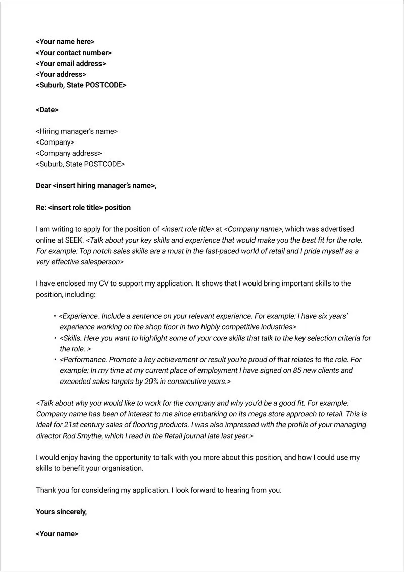
Some fonts, despite their design, are difficult to read, particularly on screen. These fonts may have unusual letterforms or tight spacing. Regardless of how visually appealing a font might seem, readability should always be your top priority. Stick with fonts that are designed for professional use and are known for their clarity. Readability is essential when it comes to a cover letter. The easier it is for the reader to digest your message, the better the chances of making a good impression. Selecting fonts that are difficult to read can undermine the effectiveness of your cover letter and negatively impact your chances of getting the job.
In conclusion, selecting the right font for your cover letter is more than just a stylistic choice; it is a critical element of your professional presentation. By carefully considering your font choice, you can significantly enhance your chances of making a positive first impression. Remember to prioritize readability, consider your industry, and maintain consistency throughout your application. Avoiding common font mistakes and using one of the best font choices can help you stand out and increase your chances of landing an interview. The right font can be a subtle but powerful tool in your job search arsenal, helping you to showcase your professionalism, attention to detail, and suitability for the role.
